Overview
My team of 4 software engineering students including myself, were tasked with enhancing a basic desktop addressbook application(AddressBook - Level 3) for our Software Engineering project. We chose to morph it into a calorie tracker cum food database system called CaloFit. This enhanced application allows health-conscious people or those who are aiming for a diet to set their calorie budget for the day; manage the meals that they take; find dishes based on keywords or their remaining calorie budget; and get data about their calorie intake progress through a report.
CaloFit is a desktop application for tracking the calories that the user has taken from his or her meals over the course of using the application.
The user interacts with CaloFit using a Command Line Interface(CLI) that is represented by a box near the top of the application screen. This is where the user can type in their commands and press "Enter" on their keyboards to execute them.
It has a Graphical User Interface(GUI) created with JavaFX. The GUI is the main display that the user sees upon starting up CaloFit.
This is what our project looks like as shown in Figure 1 below:
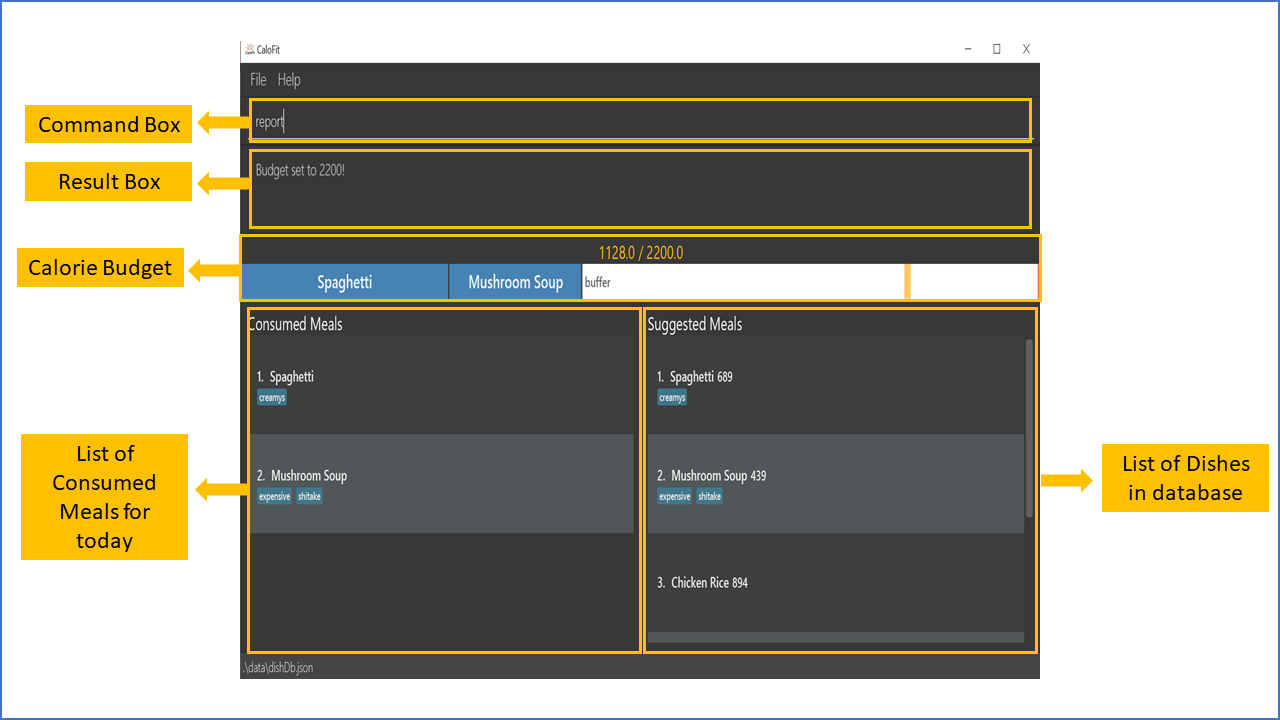
Figure 1: The GUI for CaloFit.
My roles were to handle the backend refactoring to morph the application, and to do the budget-related features. In the following sections, I will cover those changes and features, together with the relevant updates to the user and developer guides.
Note the following symbols and formatting used in this document:
| This symbol indicates important information. |
report A grey highlight(called a mark-up) indicates that this is a command that can be inputted into the command line and executed by the application.
Summary of contributions
This section shows a summary of my coding, documentation, and other helpful contributions to the team project.
-
Major enhancement: added a budget bar display.
-
What it does: Visually displays the user’s meals eaten today, as a progress-like bar. Each segment corresponds to one meal, and is sized accordingly.
-
Justification: This feature gives immediate visual feedback to users, of the meals they have eaten today, and how much more they can eat.
-
Highlights: The bar display is the most obvious user-facing result of the model refactoring process.
-
Credits: The [ControlsFX library] was used to provide the display of the segmented progress bar.
-
-
Minor enhancement: added a
setcommand to control total budget.-
What it does: This commandd allows the user to customize and set their (expected) daily calorie intake.
-
Justification: This allows each user to tailor the app for their own diet plans.
-
-
Minor enhancement: added saving of the user’s historical calorie budget data to a JSON (Javascript Object Notation) file.
-
What it does: The user’s historical calorie budget data into CaloFit will be saved into a JSON file, allowing the user’s calorie budget history to be loaded upon starting up CaloFit.
-
Justification: This feature is necessary to preserve the user’s past and current calorie budget/limit, both to reference in the budget bar, and be tracked in the statistics.
-
Credits: The methods and structure of converting a Class into a JSON file was taken from the original AddressBook-Level 3 and refactored for the purpose mentioned above.
-
-
Code contributed: [Functional code]
-
Other contributions:
-
Project management:
-
In charge of overall software architecture
-
Was responsible for refactoring the whole model from the original AddressBook 3 model, into a model suitable for CaloFit.
-
This involved many bulk and manual rename operations upon the classes, and continuous re-testing to ensure integrity.
-
I also added many more reactive properties leveraging JavaBean’s/JavaFx’s Observable mechanism.
-
This allows the UI to be able to track model updates, without incurring a direct dependency from the Model to the UI component.
-
-
I also wrote utility code in the form of ObservableListUtils and ObservableUtils in order to ease implementation of chained reactive properties, especially with those involving manipulations of ObservableList s.
-
-
-
Community:
-
Reported bugs and suggestions for other teams in the class (List of bugs reported)
-
-
Tools:
-
Introduced [Mockito], a mocking library to help test implementation.
-
-
Contributions to the User Guide
With the new purpose of the app, we had to change the AB3 user guide, with customized instructions for our application. The following are excerpts from our CaloFit User Guide. They showcase my ability to write documentation targeting end-users.
Given below are sections I contributed to the User Guide, regarding the budget bar: |
UI Overview
This section covers the various parts of the CaloFit user interface.
Command Box

The command box is the main means of interacting with CaloFit. Users can enter commands, as detailed in [Commands], in order to work with the app.
To submit a command, the user can press the Enter key.
The application will parse and evaluate the command.
Any further feedback from the command will be displayed in the feedback box below.

If any error is encountered, the command text will not be cleared, and turn red.
Budget Bar

The budget bar shows a visual overview of the meals the user has consumed today. Each meal displayed in the budget bar is proportionately sized to its calories, and is labelled by its dish name. Additionally, a white buffer segment is shown, representing the remaining amount of calories availablee today.
The yellow mark indicates the current budget limit, while the red mark indicates 120% of the current budget limit. This gives you a visual overview as to how much more the user can consume for today, and give a margin of error even when exceeding the budget.
When the total calorie count of meals today exceeds even the 120% mark, the bar will not show a buffer segment. Instead, the meals will occupy the entire width of the bar, remaining proportionate to their calorie counts. The budget marks will also move to the appropriate positions, still representing 100% and 120% of the budget.
Coming in v2.0: When a meal’s bar segment is too small, its dish name will be hidden. Information on the dish still can be viewed as a tooltip, when hovering over the segment.
Consumed Meals
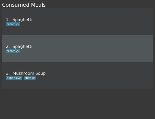
The Consumed Meals pane will display the current meals that were consumed today. This pane will automatically updating upon adding, editing or deleting meals.
Each meal displays its name and tags, together with its index in the whole list.
The edit/delete commands can be given indexes of meals from this list, to manipulate them further.
Suggested Meals
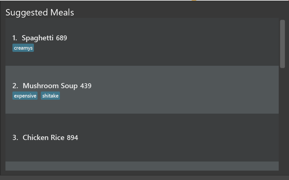
At the start of the program, the Suggested Meals pane displays all dishes that fit within the remaining calorie budget. As more meals are logged as consumed, it will automatically update and filter out dishes that no longer fit. Additionally, it will also track dishes from directly-added meals, for future reuse.
It also doubles as the result pane for the find command. To toggle it back to suggestion mode, use the suggest command.
Each dish displays its name and tags, together with its index in the whole list.
The add command can be given the indexes of dishes from the list, to add them as meals today.
Given below are sections I contributed to the User Guide, for the |
Setting calorie intake budget: set
Set user calorie intake budget for today.
This will update the calorie bar to show reflect the new amount of calories remaining.
If in suggestion mode, the suggest meals will also be refreshed depending on the calories remaining as well.
Format: set CALORIES
Examples:
-
set 2500Sets the calorie budget to 2500 calories.
_Given below are sections I contributed to the User Guide, about valid inputs. |
Contributions to the Developer Guide
Given below are sections I contributed to the Developer Guide for the budget bar feature. |
Model component
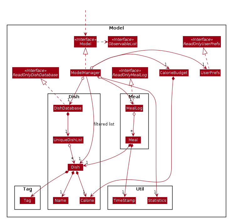
API : Model.java
The Model,
-
stores a UserPref object that represents the user’s preferences.
-
stores the DishDatabase data, MealLog data and CalorieBudget data.
-
exposes many unmodifiable properties that can be 'observed' by the UI component
-
List of today meals (ObservableList<Meal>)
-
List of suggested/filtered dishes (ObservableList<Dish>)
-
Current calorie budget (CalorieBudget) The UI components can be bound to this list, so that the UI automatically updates when the data in the list changes.
-
-
does not depend on any of the other three components.
This design allows many parts of CaloFit to be created without the fear of conflict with other classes. This is due to the Model interface acting as a Facade class that manages the interactions between the components that makeup CaloFit.
Given below are sections I contributed to the Developer Guide for the budget bar feature. |
They showcase my ability to write technical documentation and the technical depth of my contributions to the project. |
Budget Bar display
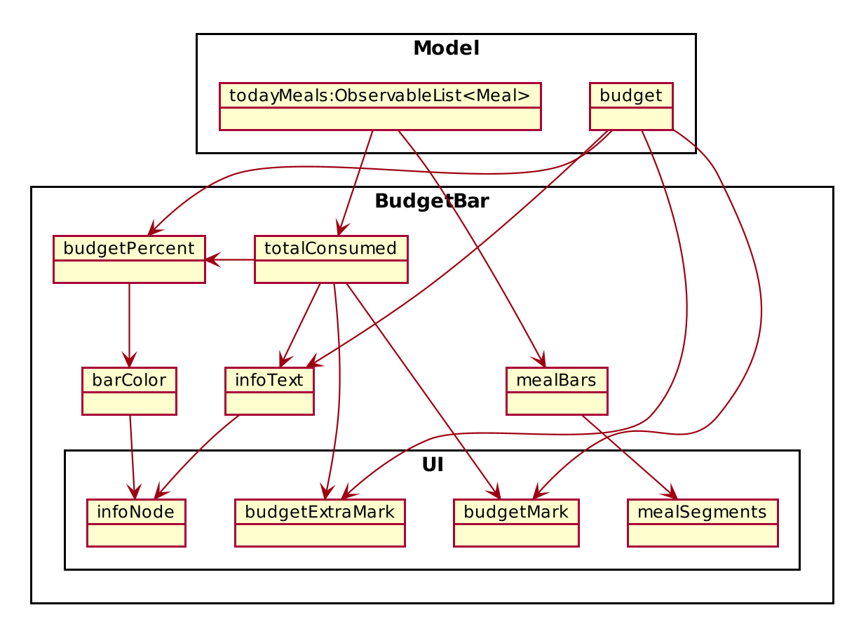
The budget bar display provides a graphic overview of meals consumed on the current day, comparing against the total calorie budget set by the user.
Implementation
The budget bar feature is implemented via the BudgetBar class.
It is a JavaFx UI component, which wraps around MealLog and CalorieBudget.
MealLog provides an observable list of meals eaten today,
while CalorieBudget provides the currently set user budget.
Using helper code from ObservableUtil and ObservableListUtil,
we compute several derived properties:
-
Total calories consumed
-
Percentage of budget consumed
From there, we again construct further observable/reactive values representing:
-
Bar info text color
-
Transitions from green to red, when more budget is consumed
-
-
Bar info text
-
If budget has been set, shows
<Total Consumed> / <Budget>. -
If budget has not been set, only shows
<Total Consumed>.
-
-
Meal segments
-
Each meal is displayed as a proportionally-sized segment in the whole bar.
-
-
Position of warning/danger markers
The following object diagram shows the reactive update dependencies.
Design Consideration
Aspect: Base UI component to display meal segments.
-
Alternative 1 (current choice): Use ControlsFx’s
SegmentedBarclass to handle display of bar segments.-
Pros:
-
No need to reimplement JavaFx
setLayoutlogic -
Better performance than
GridPane
-
-
Cons:
-
Dependency on external library
-
Have to create a separate
BufferSegmentclass to represent gap.
-
-
-
Alternative 2: Use JavaFx’s
GridPaneto lay out bar segments, andColumnConstraintsto appropriately set column widths.-
Pros:
-
No external library (other than JavaFx) needed
-
-
Cons:
-
Poor performance to due
Observablemachinery andGridPanelayout
-
-
-
Explanation of choice: Simpler implementation and better performance outweighs the cost of using an external library.